
Last summer, my mom and aunt came home from Ikea very excited to try a new craft. And I was also excited at the idea, even though I hadn’t seen what we’d be working on yet.
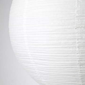
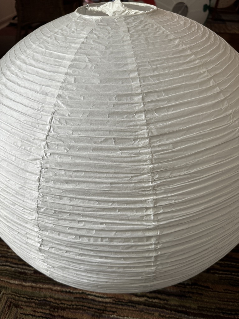
They’d come across the white, rice paper lanterns that Ikea sold, and they had decided to get the biggest ones, since they thought it would be more fun to have more space to play with.
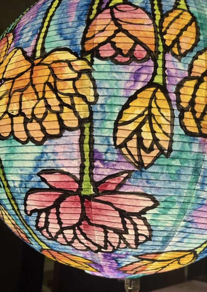
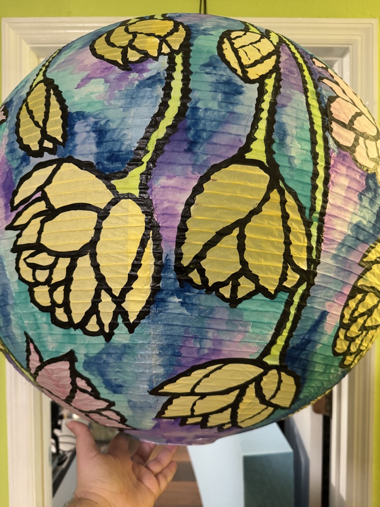
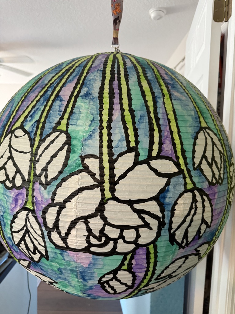
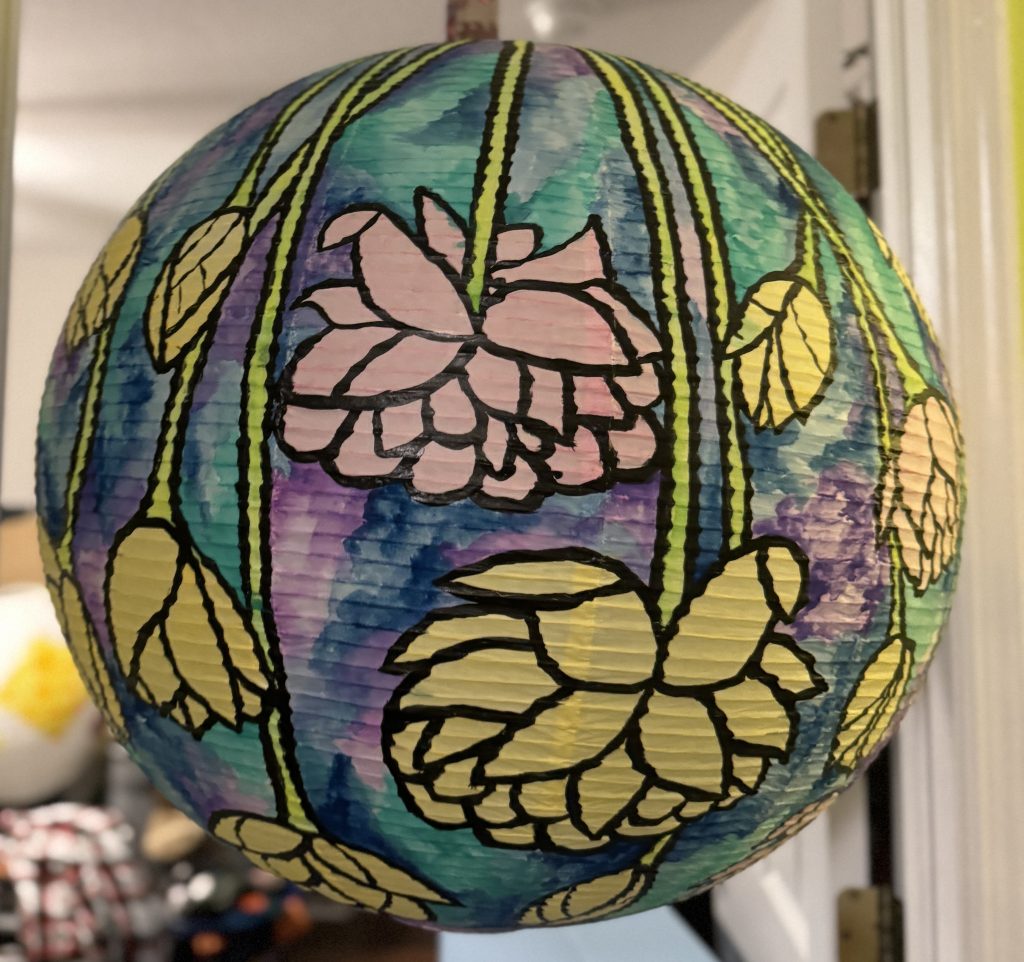
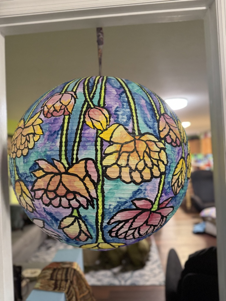
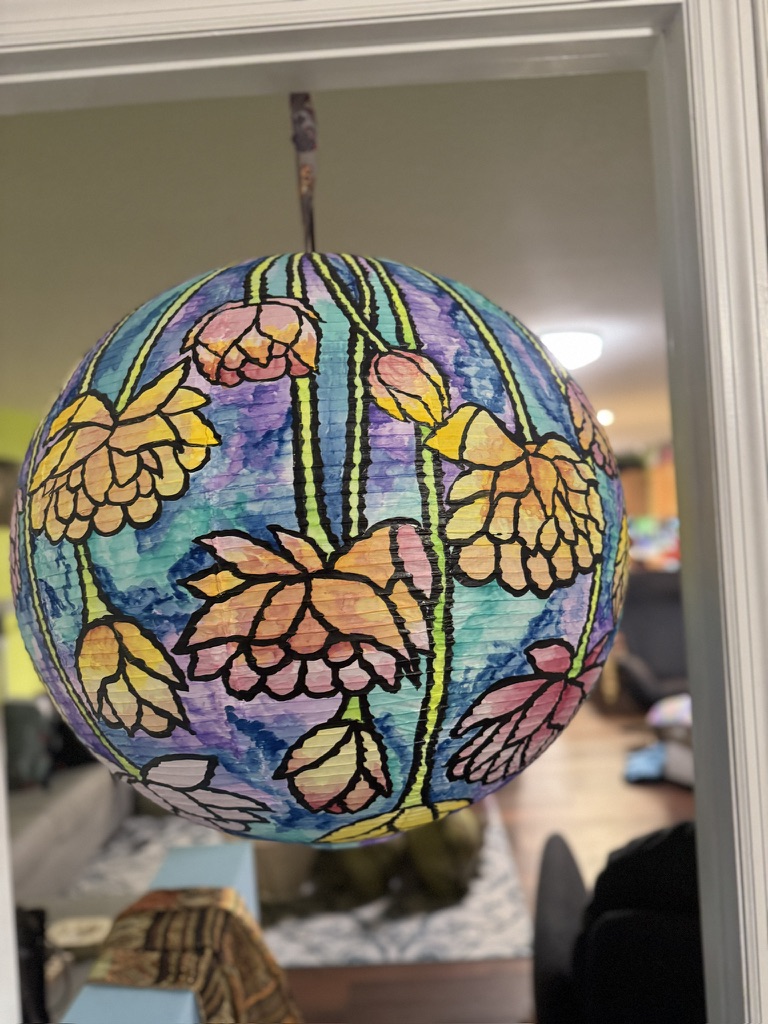
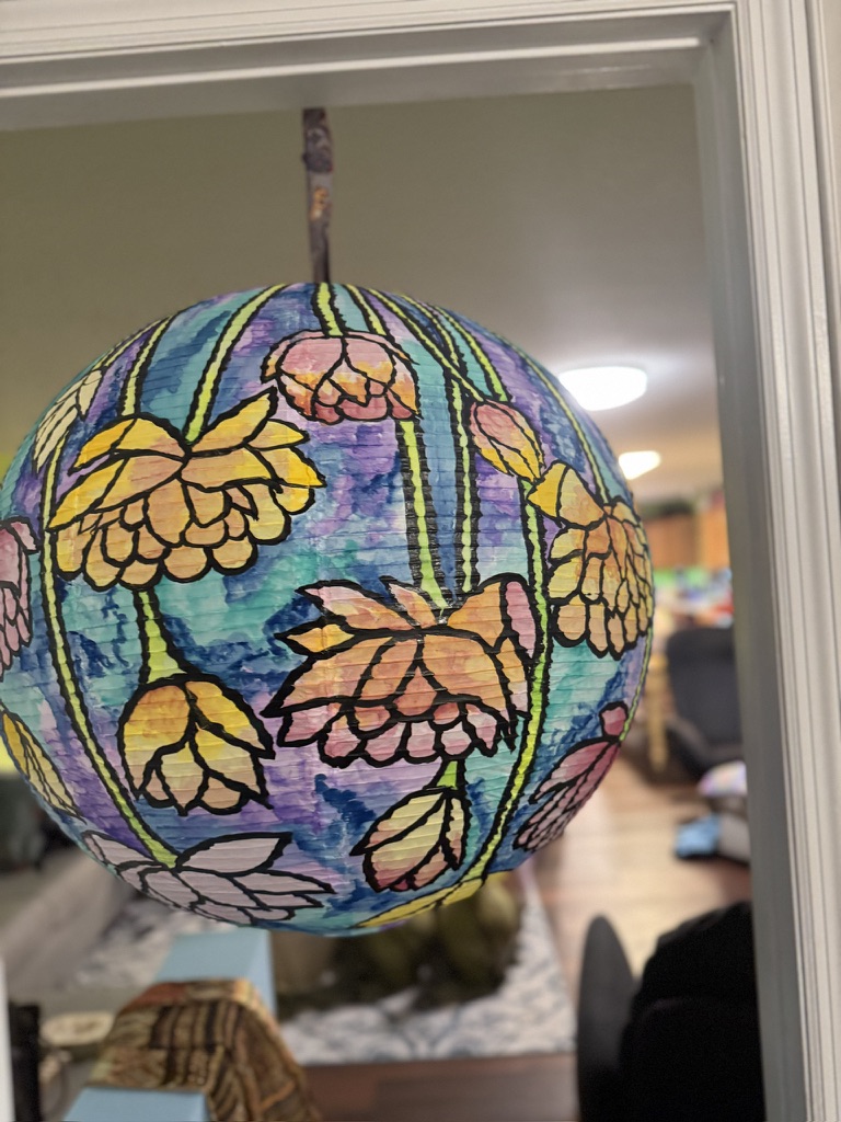
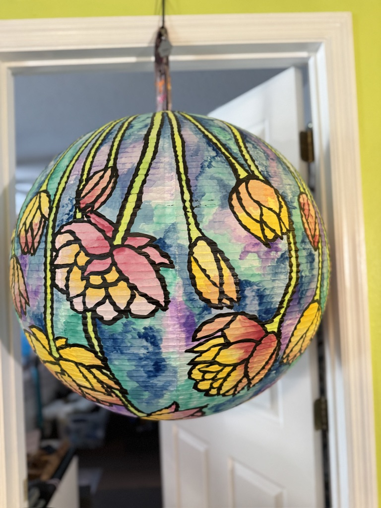
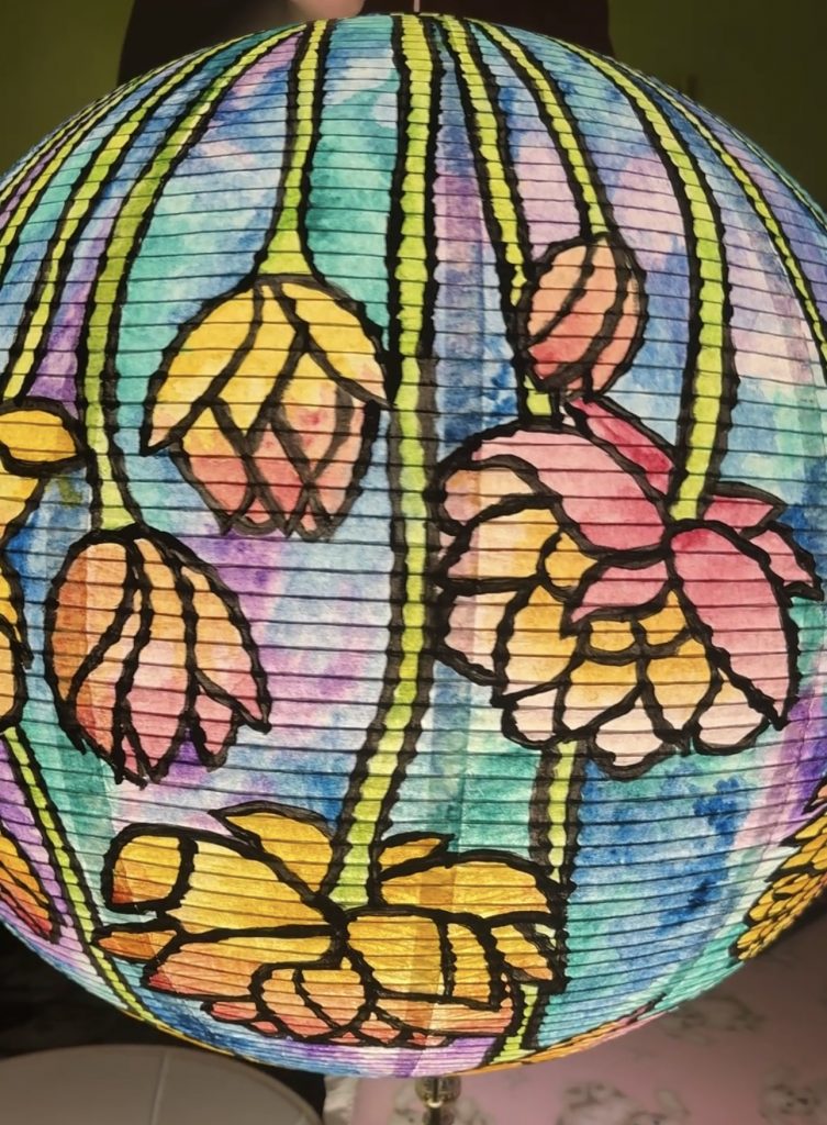
After hearing that we were going to be painting and decorating paper lanterns, I was already very excited at the idea, even more so because I had recently seen a post talking about some of Tiffany’s most famous stained glass lamp shades. I decided I wanted to attempt a stained glass look to my lantern, drawing inspiration from Tiffany’s flower lamps.
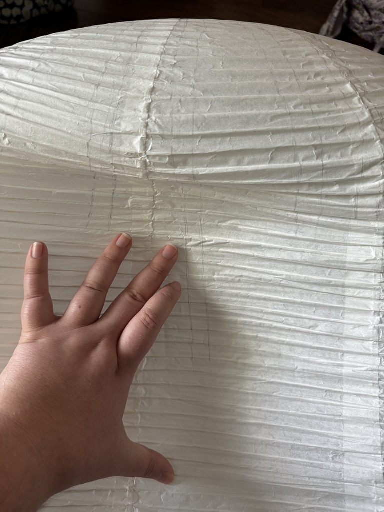
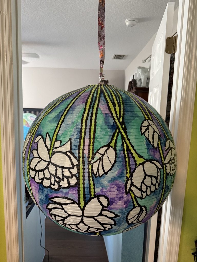
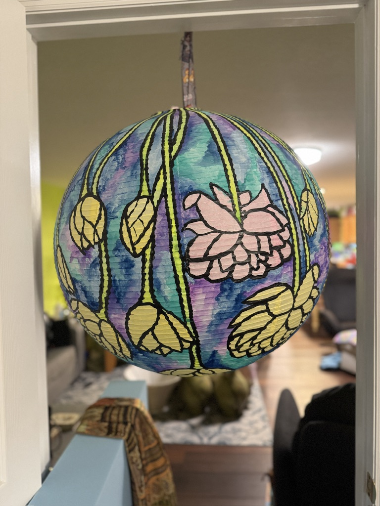
However, this was all before I’d actually seen the lantern. And when I did, I realized that this might be a bit more complicated than I thought. They were, for lack of a better term. Huge. These paper lanterns are so big. They are large enough to basically fill a standard doorway. Which I know because I hung mine in a doorway to be able to paint on it.
While this gave a lot of room to work with, it also left a lot of room to fill. So if you are going to try this, I highly recommend starting with a smaller lantern than we did.
But in case you also want to paint a giant paper lantern, here’s how you do so.
How to paint a paper lantern like a Tiffany lamp.
Start by finding your inspiration.
I went with this pond Lilly lamp. I loved the flowers and colors. And while I didn’t stick too close to the original, it was where my ideas started from.
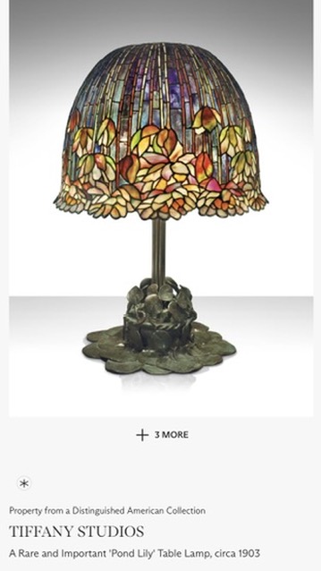
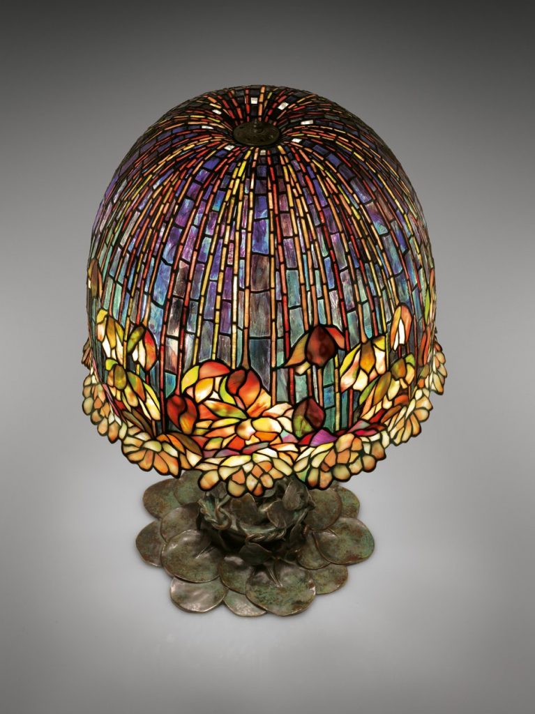
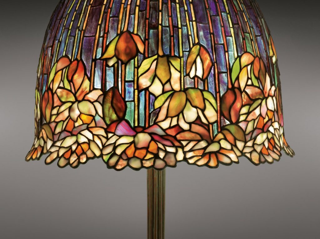
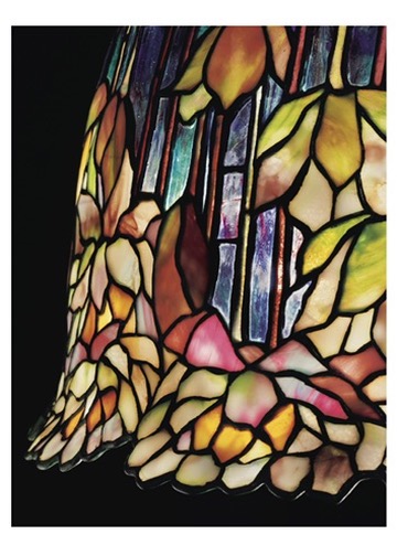
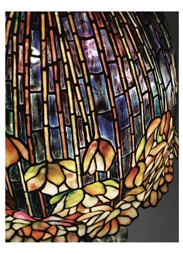
If you’d also like to use Tiffany as inspiration, I’d recommend checking out the Morse Museum’s website or even just searching for “Tiffany Lamps” online. There are a lot of options for inspiration!
Sketch Your Design
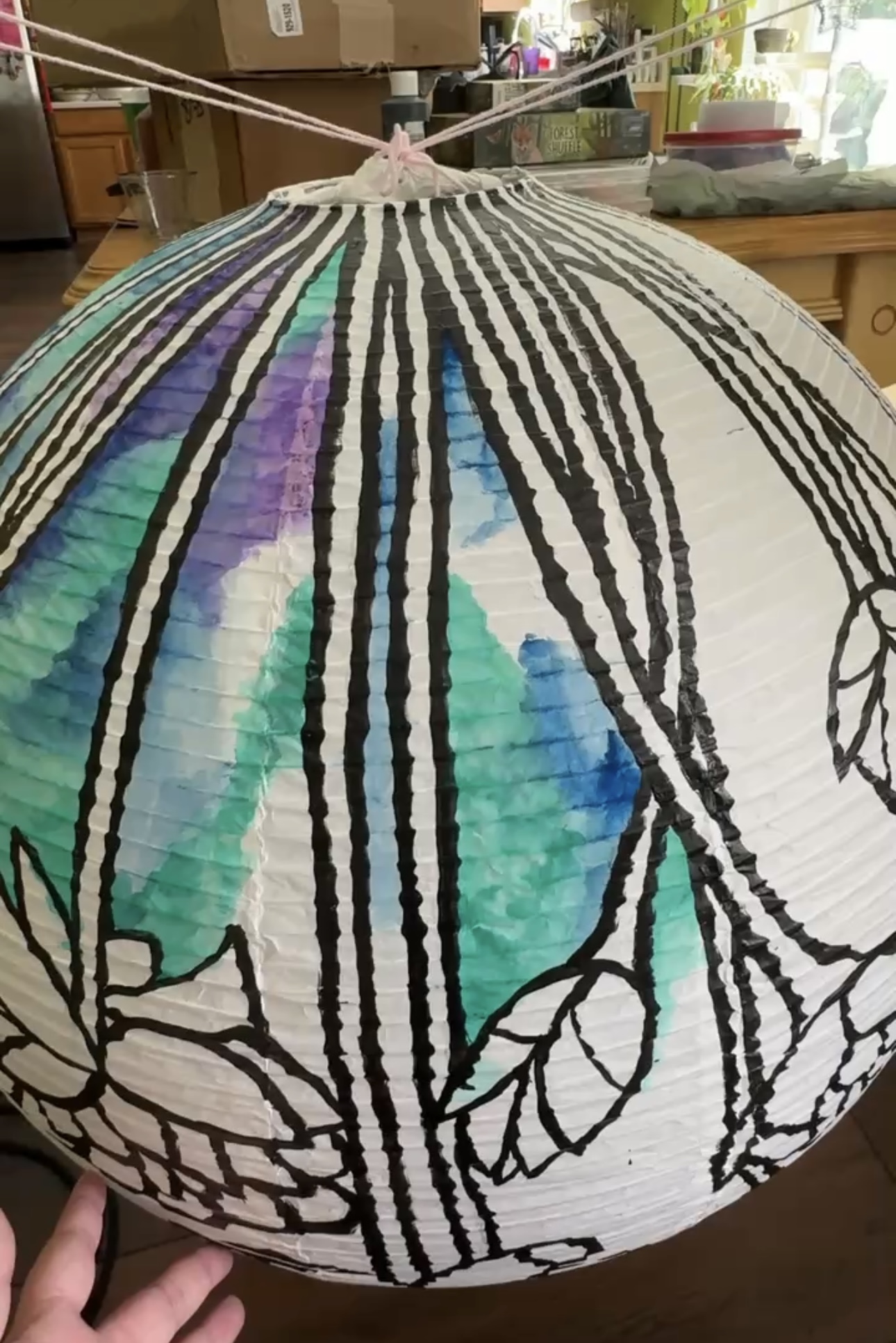
Next came the sketching phase. And since these planters had wrinkles and a ribbed structure, I found that very light and gentle lines were the way to go. Especially with how thin the paper is.
I found that I could press the lantern in on itself, and it helped me be able to sketch and see my lines. It smoothed out most of the texture, and for some reason was easier to see the pencil marks than when it was popped out and round.
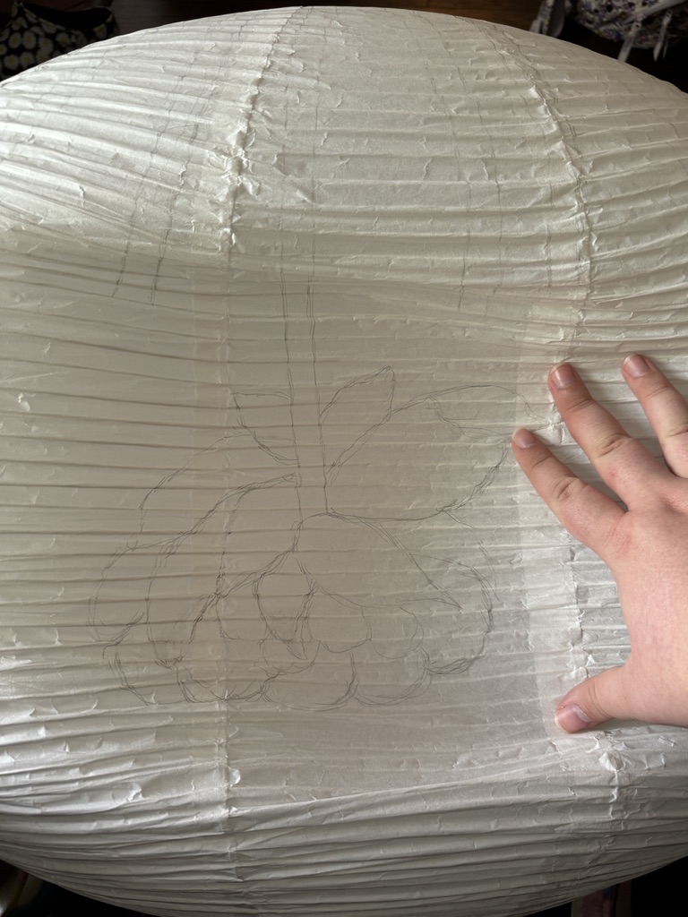
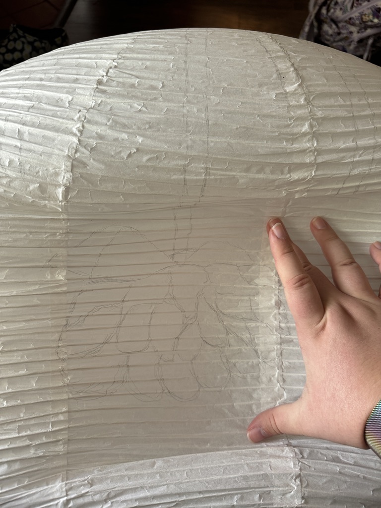
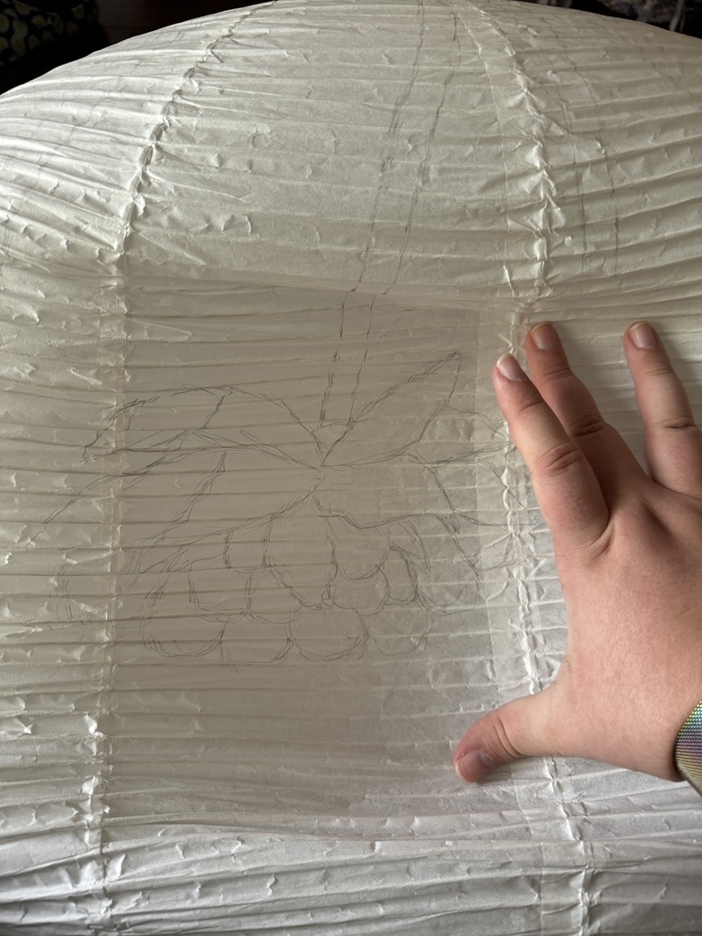
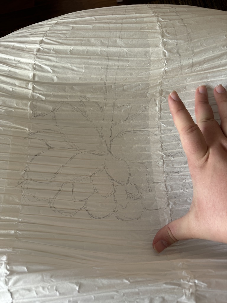
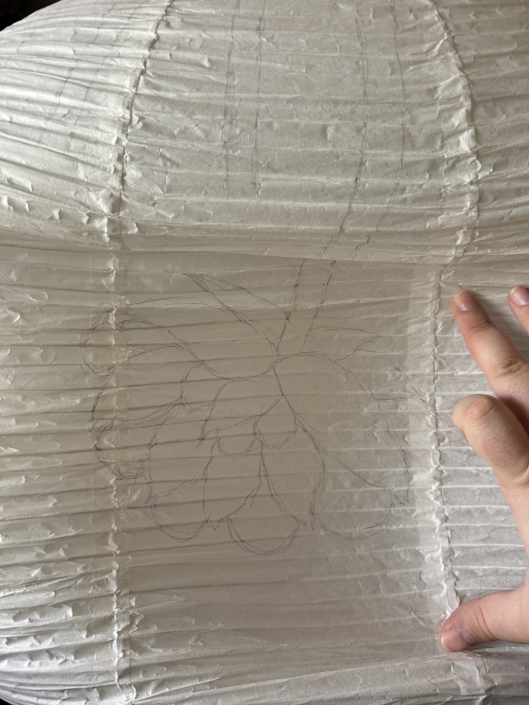
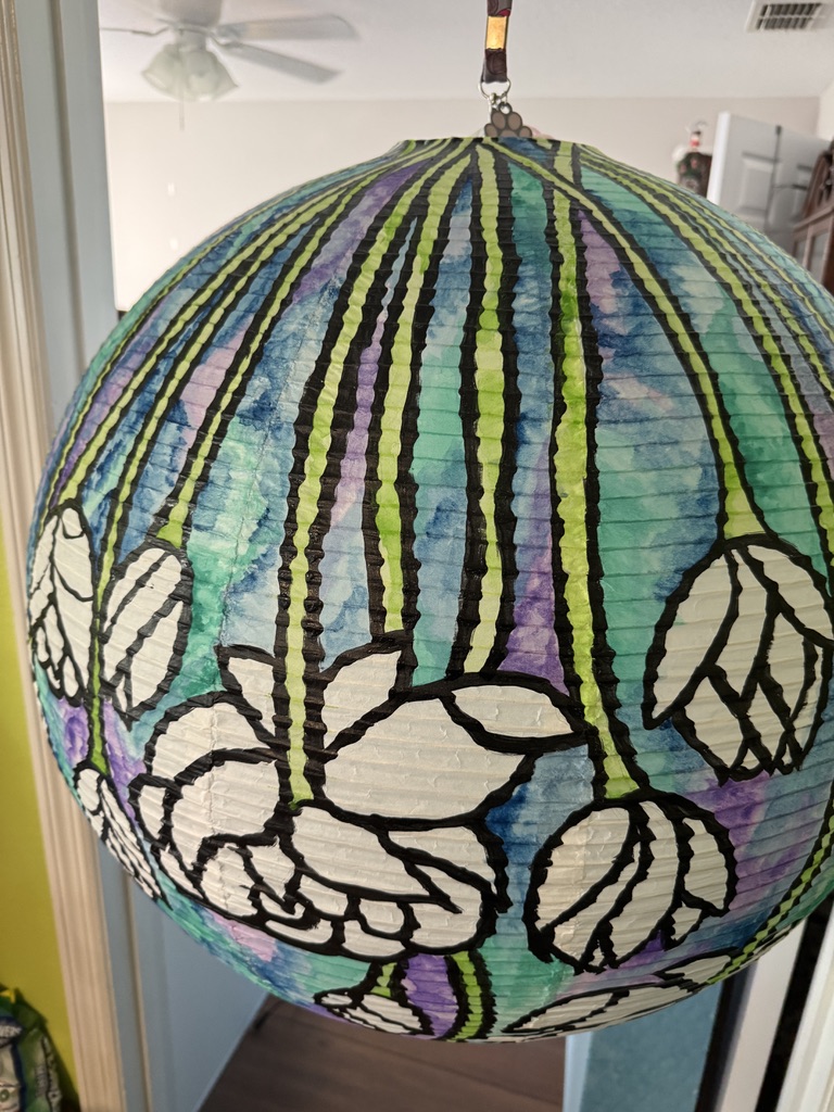
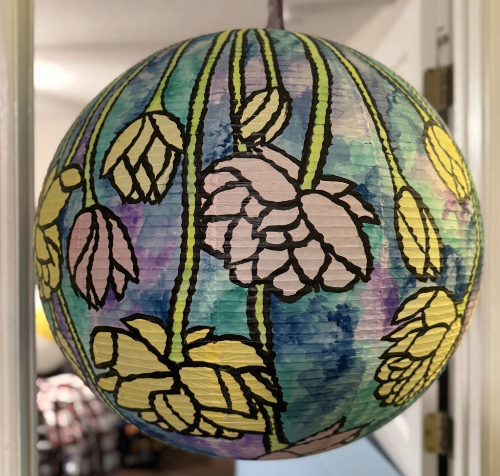
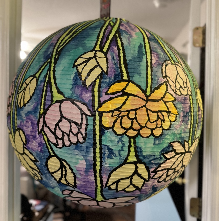
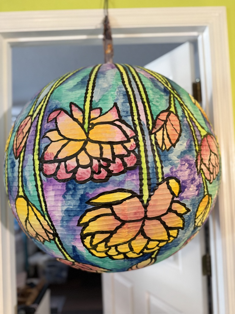
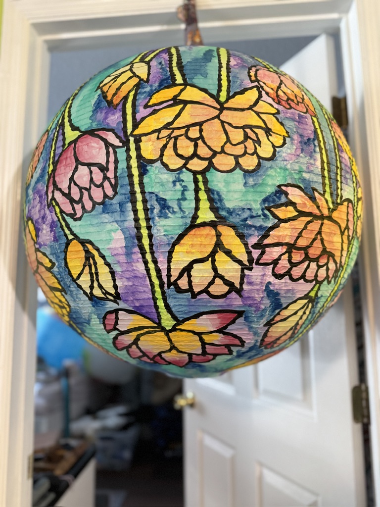
I started making all my big, blooming flowers first. I was shocked to find out that these flowers needed to be about the size of my hand, with my fingers spread. They could be even larger. I think I probably should have made mine bigger. But I think it still turned out well enough.
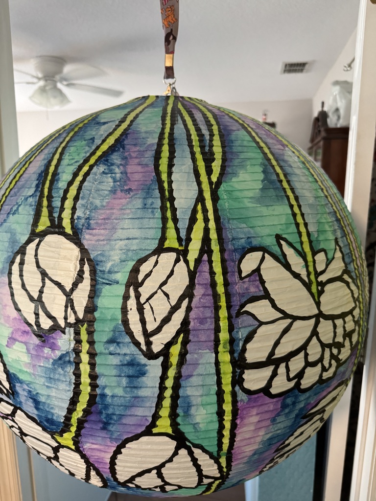
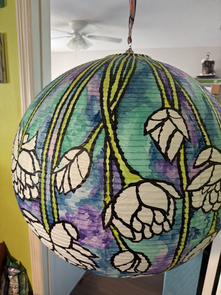
Then I filled in the space with smaller half-opened blooms and also some buds. I regularly also ran the stems up towards the top of the lantern. Since I wanted it to look like flowers draping down. I also tried to arch and curve the stems whenever I could. Since nature rarely has straight lines.
Paint Your Outlines
After the sketching came the painting of the lines. I went with bold, thick, black lines to give that same impression of stained glass. I used black acrylic paint, watered down just a bit so it would flow on a bit easier. You don’t want to water it down too much, or it won’t be opaque enough to block the light from shining through when you light it later. So play around a bit and see what works. You can always touch up thin spots later with a second coat.
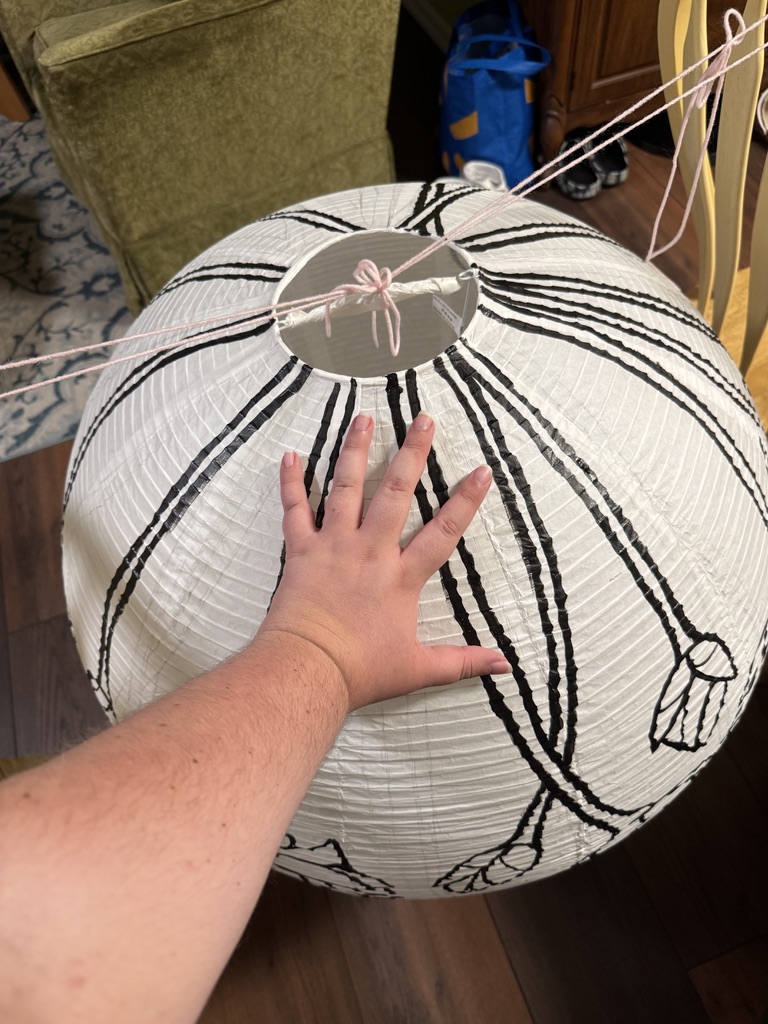
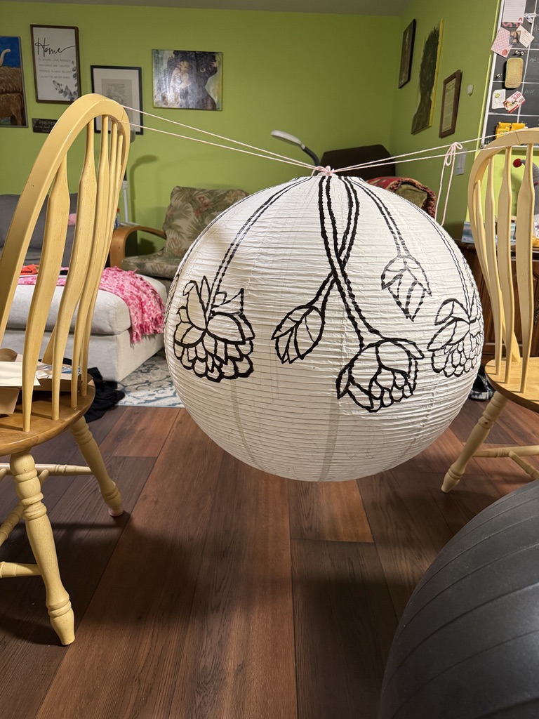
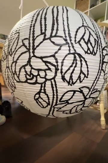
Again, I found that pressing the lantern into itself helped me be able to paint smoother lines. But at the end of the day, it’s a paper lantern. It’s always going to look a bit wiggly. So don’t stress about the lines being perfectly even. Anyone who looks at it is just going to think that it’s how the paper was folded, not that your lines are bumpy.
Painting the Background
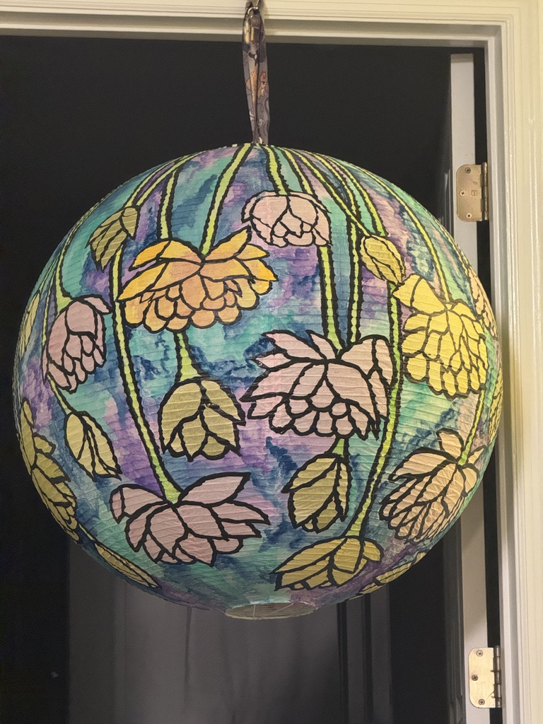
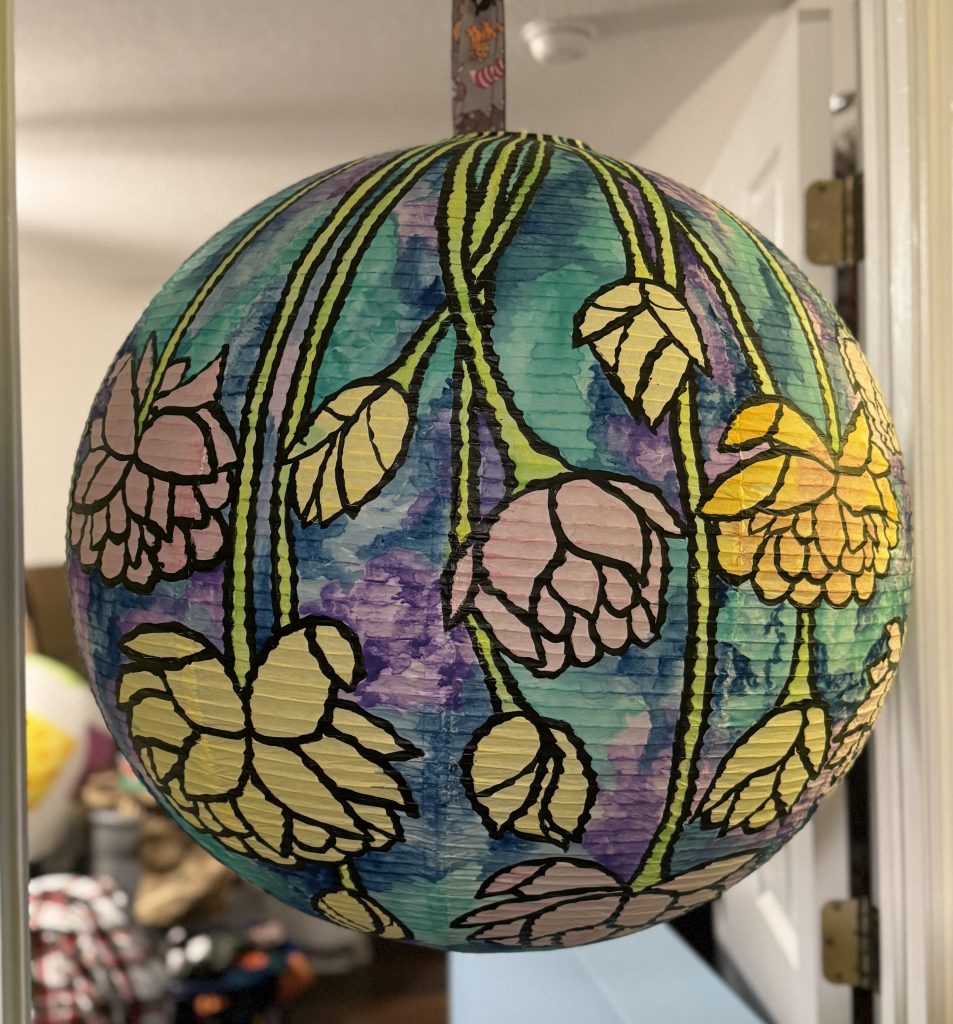
Once the lines were finished, I started painting the background. I chose to use cool tones for the background and warm tones for the flowers.
Some of these pictures were taken as snapshots from a video, so I apologize if the quality is a bit off. I found that after finishing the lantern, I had forgotten to take pictures of some parts of my process. So I had to use still frames from some videos I had taken instead. Thank you for your understanding!
I would recommend using gouache for painting your lantern. It is lightweight and transparent enough to let light through while also being opaque enough to really pop and layer well.
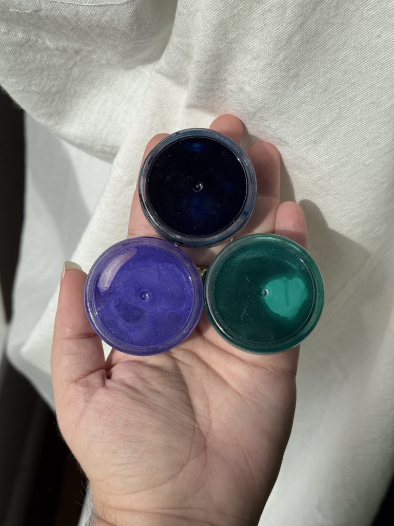
Paint Colors
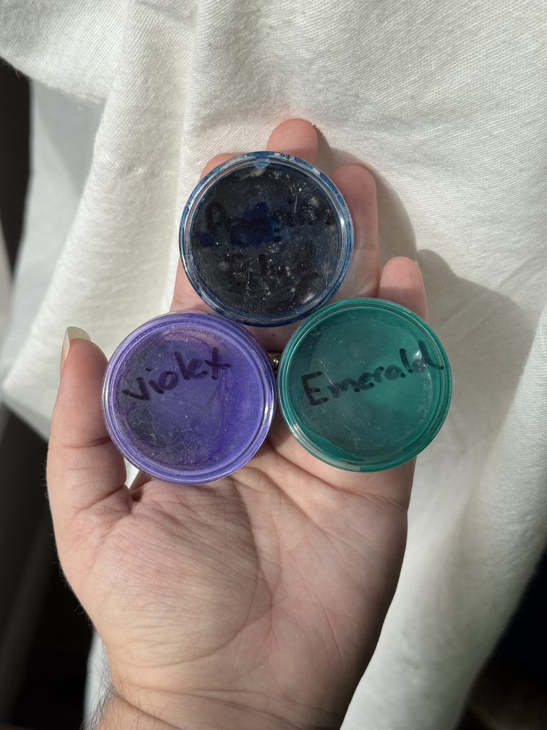
I went with these three colors for the background: Prussian Blue, Emerald, and Violet.
Prussian Blue is an amazing blue to work with because it is so pigmented that it looks like it’s a deep navy. But when you add water, it will also give you lovely pale blues as well. It is also incredibly transparent, leading me to choose it for this project as my main and only blue.
Emerald is a nice cool-toned green, and Violet is the only purple that I currently have in my gouache kit. It serves its purpose well, though I would have picked a cooler-toned purple if I was able. I’ve found that the composition of this violet can get a little pink when watered down. Thankfully, with the help of the Prussian Blue, I was able to tint and mix it in with the other colors well.
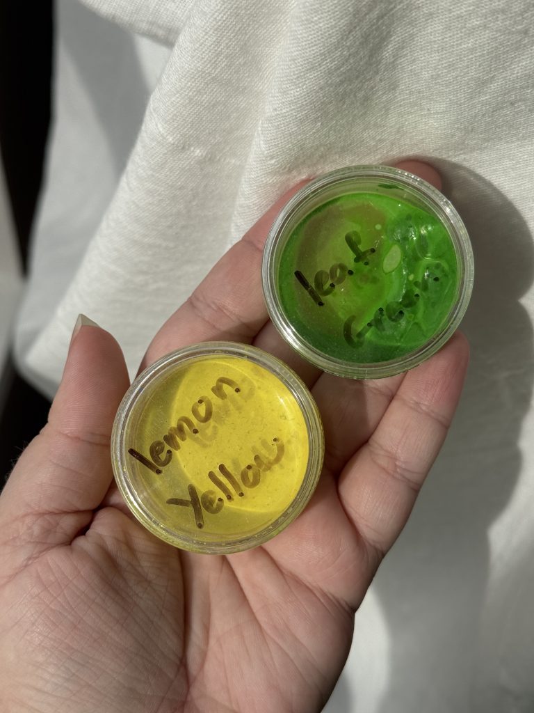
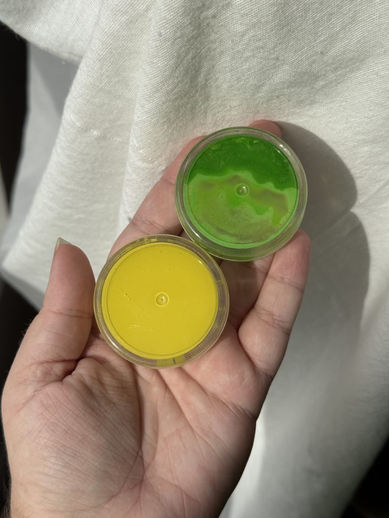
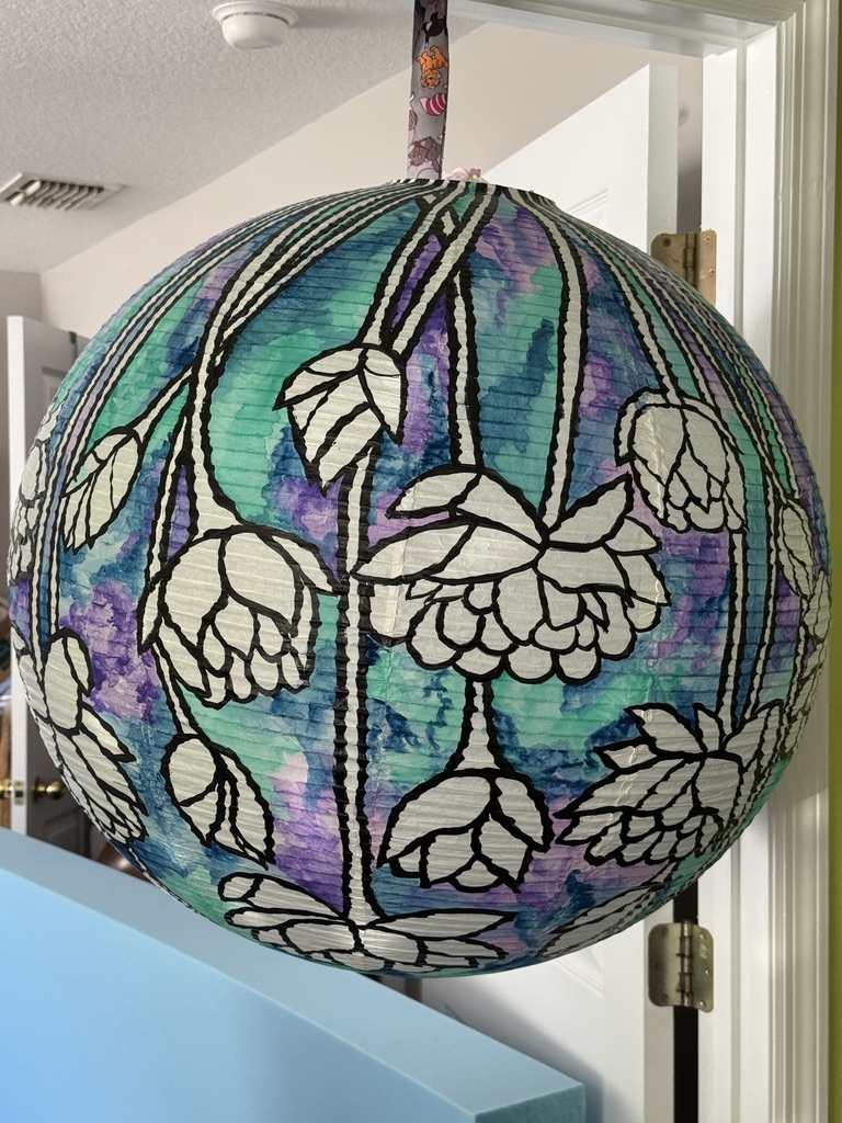
For the stems, I went with Leaf Green and Lemon Yellow. I’ve found that these two blend very well with each other to give bright, sunny greens that work well for flowers.
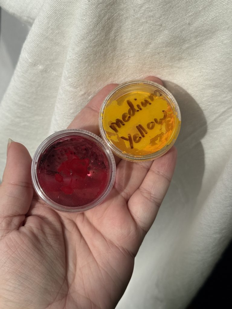
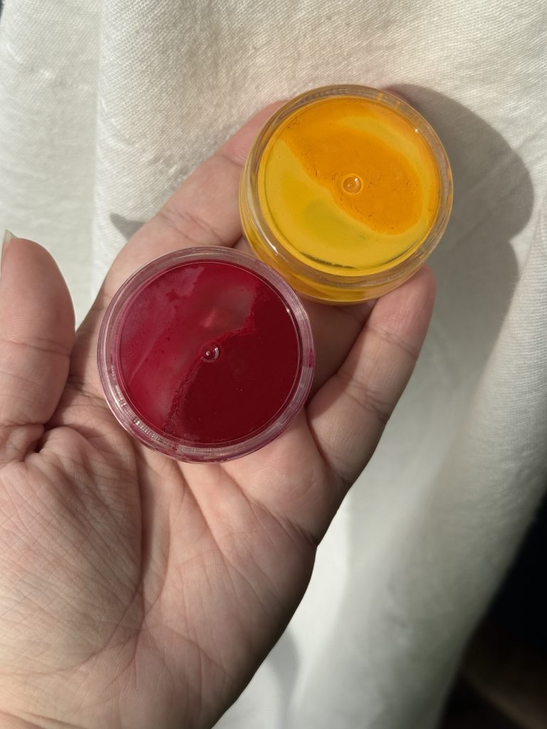
Lastly, for the flowers, I used Crimson and Medium Yellow. I wanted a warmer yellow for my flowers and a warm, deep red. I thought these two would blend well together, and I was happy to see that I was correct. I also found that Crimson was very similar to Prussian Blue in the fact that you can water it down and get some lovely light pinks. It is, however, more opaque or cloudy than Prussian blue, so it covers more of what you put it over than letting the lower color shine through.
Painting Technique
I found that the paint went on best when the paper was damp, or the paint was very watered down, especially for the first layer. The paper only absorbs so much water, so it can get wet faster than you might expect. It also seemed to absorb the dye or color of the paint very easily if it’s dry. So if you put down more concentrated paint, it will stay there even if you go over it with water later. So start watered down and build up. I also found that the colors mixed best when everything was damp. Things bled and softened more easily that way.
It’s also important to do a step and then let things dry completely. Because the paint is transparent and the paper gets translucent when wet, it’s very hard to see how the colors look until it’s dry.
All these flowers were painted the same color and dried the same color, but you can see that the one on the left is a very pretty light yellow, while the one on the right is a lot darker and almost grey-looking. This is the difference between wet and dry.
So make sure you let things dry before deciding you don’t like how it looks!
I tried to mix and layer and have the background colors bleed into each other. Get loose with it and let the colors flow. It’s supposed to be kinda messy. I found that I really enjoy exploring the different shapes the paint would make as I put it down.
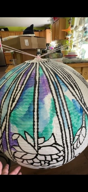
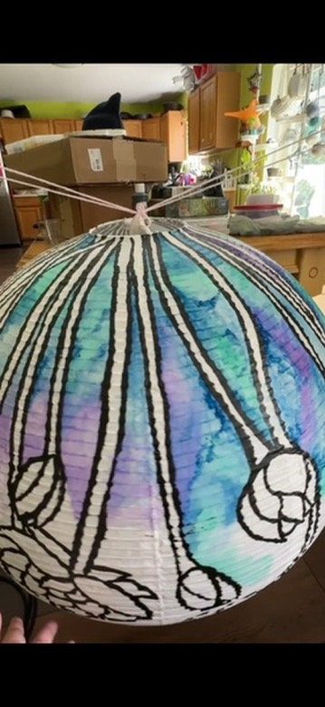
Another big thing to remember is that gravity exists, and you’ll be using very watery paint. Start high and then move down, guiding that water and paint in a controlled fall so you don’t have drips running wild.
Paint the Stems and Flowers
After the background was finished, I did the stems. I started with the Leaf Green and then went back over and did some highlights and spots of Lemon Yellow for variegation and a bit of interest. Its a small detail that’s not very obvious, but I think it helps make it a bit more interesting and nice to look at.
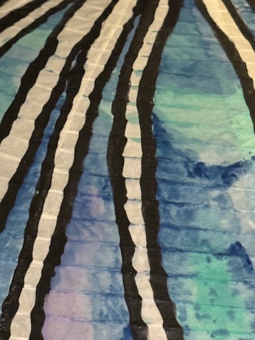
A small thing to note, I found that the paint and water would soak into and travel through the horizontal ribbing in the lantern. This led to colors sometimes bleeding into spaces, even if you didn’t paint there or there was a black line in the way. I found that this didn’t really affect the outcome of the lantern. It’s small enough, and you will be viewing it from such a distance that they become unnoticeable to the average viewer. Even those looking at the lantern close up might not see them, as they can be kinda sporadic and blend into things as you layer colors.
Then I did the flowers. Starting with a light base wash, then coming back over and adding some details. I kept everything to two colors so everything was homogeneous, but using them in different intensities or layers gave a lot of variety.
First Coat – Base Coat
Details and Shading
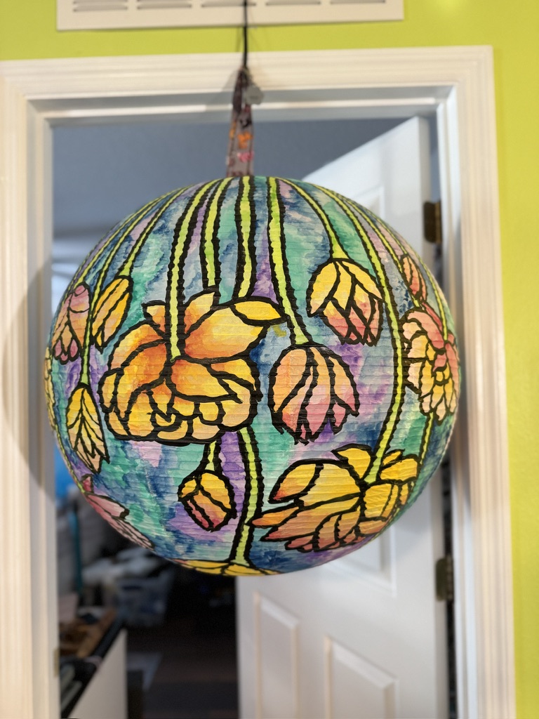
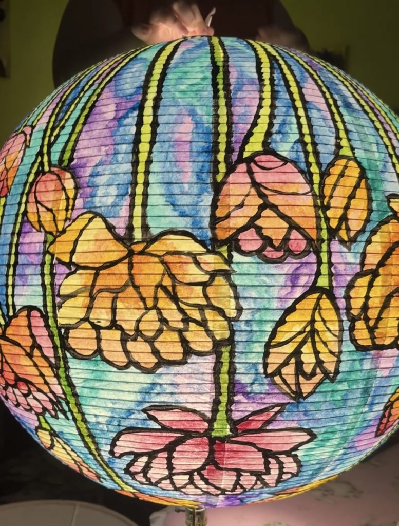
Lit at Night
After everything was dry, I slipped it over a lamp, and it lit up really well! Even though this took me around 17 hours to complete, I enjoyed it a lot once it started coming together. I’m definitely tempted to do a similar project in the future, but maybe only on a desk lamp-sized lamp shade. Lol
Until next time, Let’s Make Something.